Summary: One of the weird banes of existence for bookstore workers is coming up with displays. While gathering beloved books under fun ersatz categories should be exciting, and should be fun for browsers, they never quite work out as such. Someone has at least decided to have a little fun with it...so let's have a wry chuckle.
For my bookstore friends, "honest" labels for Barnes and Noble style displays...
BLOT: (21 Feb 2015 - 09:23:22 AM)
For my bookstore friends, "honest" labels for Barnes and Noble style displays...
Working in a bookstore, I have four or five years experience. Shopping in a bookstore, I have three decades. And one of the most fascinating failures of flow is the endcap display, generally designed around a ersatz category such as "Books containing people eating peanut butter" or "This person died" or "It's Superbowl weekend, here are books somehow related to
The problem with them is that they do not seem to work. People's eyes gloss over them. Maybe if they see a book or name they like, they might stop and browse, but unless the theme really resonates with them they usually don't stick around very long, especially since your average display looks increasingly like this...

...and the full, lush, organic vibe that seems to attract people to book displays is weeded out to make sure the books, and other non-book items blended in, have as few titles as possible and those titles are glimpsable from a distance. Space in between books is one of the least attractive thing in a book display, unless carefully balanced, and it is rampant nowadays.
Secondly, bookstores only stock 1-2 copies of a book, so these displays eat up every copy the store has, meaning shoppers have to play "guess the endcap" to find books sometime.
Thirdly, while these endcaps can be a passion project for some workers, I've spotted, from the manager-of-a-bookstore side, how it can break down when one worker has a vision and some other worker, driven by a belief that all displays should have the same flavor or the same level of neatness or that worker #1 missed some obvious choice, constantly interferes. And shoppers use them for the "quick-shelve" option. This is assuming, of course, that the display is not already littered with trash as people have dropped off half-drunk, humidity-sweating Frappucinos® along the way.
Finally, their most damning characteristic is simply an overall lack of vibrancy. Little about them really scream, "Come in and SHOP!" and so they interact with only casual browsers who stumble upon them while a) wasting time or b) trying to find some specific book they want. Had stores set it up so that people knew, from the front, that there was an EXCITING DISPLAY ABOUT X or an INTERESTING DISPLAY ABOUT Y, ALL THIS MONTH, it might actually drive book sales instead of being one of the things-bookstores-do. This is not always true. Some bookstores have amazing ones. Just, you know, in general.
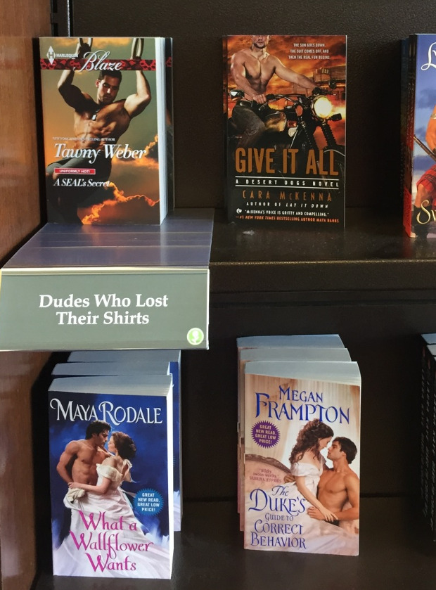
That rant aside, I came across a Tumblr post where Obvious Plant [I assume] has worked out a few "honest" ones, and it made me chuckle. Such as "Dudes Who Lost Their Shirts" and "Women with Short, Professional Haircuts". See those samples below, or click the link above for full.


OTHER BLOTS THIS MONTH: February 2015
dickens of a blog


Written by Doug Bolden
For those wishing to get in touch, you can contact me in a number of ways

This work is licensed under a Creative Commons Attribution-ShareAlike 3.0 Unported License.
The longer, fuller version of this text can be found on my FAQ: "Can I Use Something I Found on the Site?".
"The hidden is greater than the seen."

