Summary: I recently had a big part to play in the design, editing, and printing of our first ever library newsletter: The Call Number. I decided to share a few notes that can help to act as pointers, tips, warnings, and/or humorous commiserations.
Some personal notes about designing a library newsletter (bonus: open source tools and submissions across a department) (extra bonus: tips and tricks section)
BLOT: (12 Oct 2013 - 06:59:22 PM)
Some personal notes about designing a library newsletter (bonus: open source tools and submissions across a department) (extra bonus: tips and tricks section)
This year, a new department was formed at our library: Reference and Information Services. One of the goals of this department—composed currently of a director, an instructional librarian, an electronic resources librarian, a reference assistant (me, who also does some work on editing/perfecting the website, Libguides, and chat reference), and a graphic design student—was to put out a newsletter talking about our new resources, to discuss some recent and upcoming events, to show off some photographs, to link to our social media, and to provide some basic information about our hours and policies. The window to work on the newsletter was roughly the time period between Open House (the 20th of September) and the first week of October (last week), so we only had a couple of weeks. This was a new thing to our library, so the specifics was left up entirely to us.
Setting the goals and getting started, aka The Open Source Decision
Early on I decided to make use primarily of two open source tools: Scribus (for layout, text, etc) and GIMP (for graphics). You can do a lot with Scribus and GIMP. A lot. They have a lot of great features, you just have to know what you are doing. I use GIMP often, so part of the two week design cycle was learning how to use Scribus just as well.
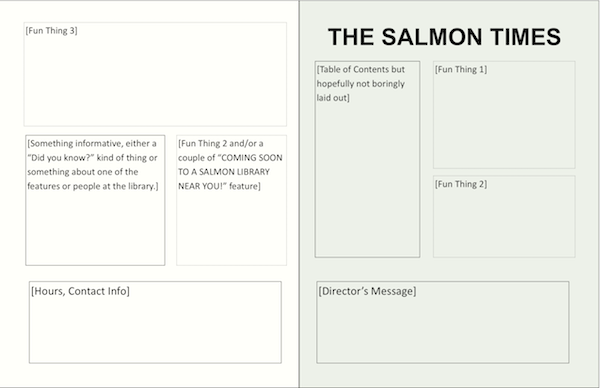
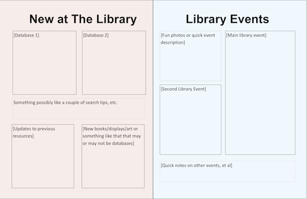
My first stage was to come up with four rough pages, so that a ledger-sized sheet of paper, printed front and back, could be folded over to make the newsletter's physical copy. The front page seemed easy enough—a splash of introductory text, a title, some basic eye-catching bits, and a Director's note—as did the back page—some fun stuff like photos mixed with dry stuff like a directory. The second and third pages were trickier, but in the initial meeting we had decided to focus on promoting resources, for one, and to talk about events, for the other. In this case, the electronic resources librarian took the one about our new resources, and the instructional librarian took the events. Our initial mock-up looked like this [sent this out to the others to give them an idea of how much content we could have]:


You'll notice that it's called
At any rate, with a mock-up in place, everyone had a better idea of how much content to provide and what our goal was. We didn't really stick to the layout, at least not in a precise way, but I'd recommend doing something similar if you have such a product.
Getting all the ducks in a row leading to an ugly duckling stage, rethinking some concepts
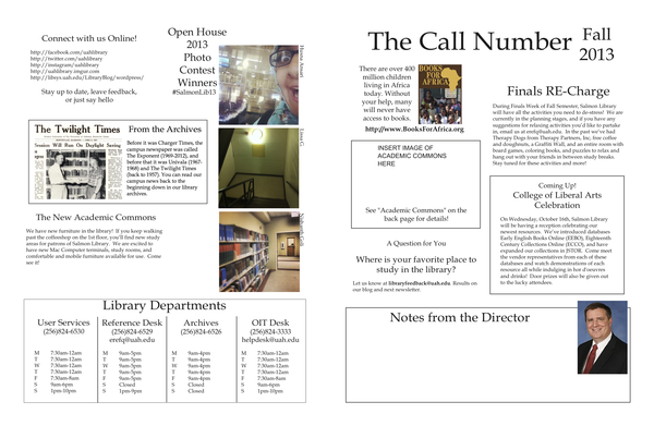
Over the next week or so, we got in content describing some new databases, extensions to old ones, a few events, and some other bits. We were on the path to making some broad mistakes, though. First off, as you can see from the image below, the layout had a number of issues. It wasn't properly balanced, a reliance was being made to use visual break-outs [boxes, mostly]. The front page was cluttered and un-even, the back page was really un-even and had dead-space. There was few natural contrasts.
What's more, there was very little interaction with the reader. We would tell them [on pages not pictured] what such and such event was, or what such and such resource was, but we didn't really do it in a way that emphasized how said events and resources were for our patrons. We had a "question for you" that asked for some feedback, but that was about it. The "Departments" box on the back took up about 1/4 of the back page, but did it blandly. The resources and the events were laid out in a imbalanced 2x2 grid with a stripe of extra stuff in between, with the boxes shaped to the size of the content instead of the other way around. Arguably the brightest point of this draft, the Open House photo contest winners, was shoved to one side in a weird way.

Some good things were happening, though, due to the way this draft wasn't really hitting the notes it needed to hit. Because our resources were displayed like promotional paragraphs, each taking up a rough quadrant, and focusing too much on those with a liberal arts bent, I rewrote a lot of the second page to make it more interesting—tighter and more to the point—for the patron. The events page cut out one event and expanded the other three, and I was able to work in bit about our library instruction. More photographs were applied throughout.
Thanks to feedback from my department, the front page and the last page were re-balanced, a lot of the artificial boxes were done away with [with some left in for spice]. The picture for our library director was re-chosen to be a warmer, brighter picture. The "hours and contact" box was more standardized, made smaller, and more information was added in. All the links were made into actual working links on the electronic copy.
And, nearly finally, the Books for Africa program was expanded on the second page to more complete, and to seek more interaction.
The Good and Bad of the final touches, and the mistake that slipped through
We got it all nearly finalized. All that was missing was a formal title. The graphic design student made one, with the added "joke" of an actual call number being used [in this case, it is for Charles Olson's
But, here's the mistake: in the middle of the final edits, we briefly moved some stuff around to see if we could make room for mailing labels [we couldn't, not really], and, upon noticing that the italicized titles had lost their formatting, I reapplied them. Except apparently the font didn't re-embed in a way that wasn't over-ridden by whichever computers were looking at it [we could see it just fine at the desk, but the copy center's computers apparently didn't have it]. Those two things lead to this, the errant "r":

Sigh. Ah, well, C'est la vie. Last minute changes always have to be checked doubly. I now know a few ways to prevent that and to double-check, and will use those methods in the future. Ultimately, it is one letter out of a fairly dense four page document with lots of sub-elements where nearly all the rest are just fine. That "r" will haunt me, but I will mock it for doing so.
The Final Product
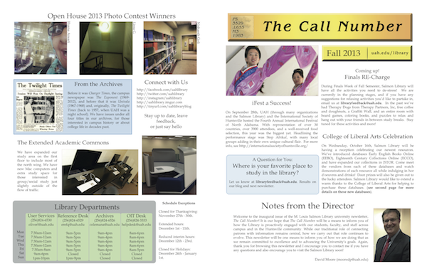
At any rate, here is the final product, the newsletter of UAH's Salmon Library: The Call Number, Fall 2013, at least in PDF form (the print copy is a higher ppi, naturally, but the PDF is perfectly fine for screen reading and personal printing). Here's what the front and back page now looks like [almost, this screenshot was before I fixed the font goof, not that you are likely to tell at this image size]:
It's not perfect, but it is bright and friendly and has better interactivity with our patrons and is a big thank you to all those at the school that work with us to help us to fit into the UAH ecosystem. It has gentle asides and flavor text. Pretty much every type of patron, from students to faculty to guests, should have some information they can enjoy gaining from it. By the way, the digital copy fixes the font whoops in the print one, but I'll let the other mistakes stand. I'm proud of it and my coworkers.
Some final tips, tricks, and warnings, etc
Now that I've written a bit and you've read it, I decided to keep you here for just a moment more as I share some tips and tricks and ideas I've learned from this experience. Some of which might help you. If you've had any fun stories in a similar light, feel free to mail me and let me know.
- Work with what you are comfortable with. I know several librarians who use Word or Publisher to come up with fun and informative newsletters. Never feel like you have to be cutting edge, however...
- If you have time, do try to experiment with a few other tools to expand your working knowledge. The program I used, Scribus, is open source and free. Others aren't. Advantages of the more difficult tools is that they ultimately give you more control. One of the deciding factors is how you plan on distributing the materials (Word tends to work well with Outlook, for instance, while InDesign might not except for mailing out PDFs).
- Make a rough layout to start with so that everyone knows the goal, but then feel free to break some of it to better fit your final product.
- Do not be afraid to edit the content to fit the layout that best displays it, because making your layout entirely beholden to your content will lead to some pretty funky pages.
- Make sure everyone who is submitting content gets preview copies along the way, it helps them to see how their contribution are fitting into the big picture, and they might have ideas of what to fit into the gaps.
- The editor of the project, though, should have final word. There will come a time where too many chefs will ruin the stew.
- Have all your edits done before you send it to get a proof. Any changes made after that will need another proof, so plan time accordingly.
- Aim for sub-content that is varied in tone and purpose so that anyone who stumbles upon it can take something away from it. Engage your readers into playing along, rather than just leading them through walls of text.
- Maximize the value of the various distribution channels. Electronic copies can be edited more readily [though do not use this as a crutch, measure twice and cut once, as the saying goes] and can have active links that people can click. Print copies can have vibrant colors and make a nice record of your institution. Email-format copies can be easy to distribute, though easy also to ignore, while having linked copies (PDF, DOCX, etc) can be better checked for how many times people view and such. Study a little bit about print versus screen quality, too.
- Finally, don't beat yourself up over mistakes. Learn from them and minimize them. Be more careful with the future, but focus more on the project in a way that promotes you and interacts with your patrons, rather than a search for perfection that might not ever get published. You will get better as you go along.
Librarians and Being a Librarian
OTHER BLOTS THIS MONTH: October 2013
dickens of a blog


Written by Doug Bolden
For those wishing to get in touch, you can contact me in a number of ways

This work is licensed under a Creative Commons Attribution-ShareAlike 3.0 Unported License.
The longer, fuller version of this text can be found on my FAQ: "Can I Use Something I Found on the Site?".
"The hidden is greater than the seen."


