Summary: I love Stylish. Here are some tips for using it to get rid of the worst of the web, so you can focus on the best.
From blocking all YouTube comments to turning off Twitter's Trending Topics (and Who to Follow), why Stylish is a most awesome extension to have...
BLOT: (04 Oct 2011 - 03:34:13 PM)
From blocking all YouTube comments to turning off Twitter's Trending Topics (and Who to Follow), why Stylish is a most awesome extension to have...
SHORT CODE: http://wyrmis.com/b-00i
My first brush with Stylish was back in my heady Myspace days, which would make it...2005, 2006? For those that do not remember Myspace, or only remember it ironically as a less successful Facebook, it is easy to ignore a couple of its strengths: it had, at its height, a relatively seamless launch platform for up and coming bands and it allowed you to have much more control of your profile. Too much control. It simultaneously reached zenith and nadir as everyone rushed to get as much glitter, Flash, blinking letters, mismatched colors, and eye piercing fonts as they could. I never knew why. Presumably, some degree of narcissism would lead those wretched, untrained stylists to look at the horror they had wrought. This mean they either ignored it (abject apathy), chose it because they liked it (depicting a degree of brain damage), or chose it to punish their own friends. Which is psychotic. Whatever the cause, I downloaded Stylish, set up some scripts to make everyone's Myspace profile look like my profile, and swallowed the site whole in my own particular brand of solipsism gone mad. Just FYI, I do the same thing to my Livejournal friends, though in LJ's case, it is an official feature.

Twitter before Stylish
In these days of nearly universally generated, as opposed to designed, websites, Stylish is even more powerful. Once it was just a way to make sure fonts stayed a proper size, avoided certain color contrast issues, and so forth. Now, though, you can greatly alter how websites appear. It is not automatic, you cannot merely say, "I don't want to see this,", you will have to do a little work, but that's ok. It's not superhard but it does take a little bit of discipline. I'll start with two practical examples and if people like those, then we can try something a little more creative.
Step one, you are going to need Stylish. You can get it just by going to your Add-On section and searching for new Add-ons, or new extensions, or however your version/browser words it. It comes for Firefox and for Chrome. I only rarely use Chrome, so I don't know much about it. I assume it is almost identical, but you might need to adjust some things. If you are using Opera or Internet Explorer or Safari, there may be something similar. The big trick is you need something that interrupts the CSS, or the stylesheet if you prefer. Anything that lets you inject custom styles should work.
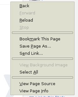
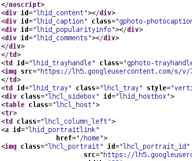
Step two, and I'll stick to the assumption that you are running Firefox for now, is to learn the trick of looking at page sources. The HTML/etc that is actually being displayed. There are no doubt a number of tricks to do this, up to downloading the page and opening it in a text editor like Notepad or Vim, but you can use the [CTRL] + [u] hotkey combination [note, that's a lowercase "u", and in Mac use the [CMD] + [u] combo], or right-click on the page and choose "View Page Source".

Step three is going to be the hardest for the untrained eye. You have to find the section of the page dedicated to comments, advertisements, blaring announcements, or whatever it is that you want to change. Sometimes it is obvious and you see either a <span class="comments"> or similar, and sometimes it is something complicated, like <div class="dis_major_grey blue-bak center"> or so on. Find a bit of text in the section you are looking for and then do a [CTRL] + [f] search for it in the source. That sometimes helps. Sometimes you just have to power through. And in some cases, there is no set style or easy to get out bit of styling to even use, in which case you have to find another way to accomplish the task (something like Noscript or AdBlock might be up your ally). Unfortunately, if you are bad at CSS, looking through HTML, and so on, there might not be a whole lot to recommend outside of doing some online research to get a little bit better. It looks alien at first, but actually is fairly quick to read with a little practice.

Don't Panic... I promise
I am not going to go into how to whack into various bits and anything super complicated from this point on. I'm going to stick to the two examples below. But, based on steps two and three, you should be able to extrapolate and "reverse engineer" what I did so as to develop your own strategies.
If you are using Firefox version > 3, after you install the Stylish plugin, you might find yourself having to go back through Add-on menu to look at it. If you look under "View → Toolbars" there should be a "Add-ons Toolbar" you can toggle. If the Stylish icon doesn't show up, you can customize the toolbar to add it. Or you can just go through the menu, either way.
First off, let's look at getting rid of Youtube Comments. Why? Well, they are crap, aren't they? If they are not spam, or someone trying to trick you to look at their channel, they are probably rude, pointless, lacking intelligence, some variation of "Thumbs up if [insert some reason that is basically just an attempt to get attention], or outright inflammatory. What good comments are available are basically buried under a mile of poor user interface design. For a site worth that many billions of dollars, they are a bane, a pain, and basically contribute to nothing but heart disease as your stress and annoyance levels hit the roof. And, AND, you can get rid of them with a single simple line of stylesheet overrides.

If you have a Stylish icon in your browser, go to Youtube.com (and pick any video, preferably one you like but has dumb comments so you can see the joy in action), click the icon and choose "Write New Style → For youtube.com" and a box will pop up. It will have most of the information below inserted, but that's ok. If you do not have the icon, then go through the Add-On menu, find your Stylish submenu, and choose "Write New Style". You will need to enter all of the information below:
@namespace url(http://www.w3.org/1999/xhtml);
@-moz-document domain("youtube.com") {
div.comments-section {display: none !important;}
}
Right now, all of the comments are inside of the comments-section div, which might change, but for the moment should bring you bliss. Simple name it something like "Youtube Sanity" and click save and you are good.

For the second, there will be multiple lines, but it will do a bit more work. This is for Twitter. If you like going to Twitter (the website) but hate having to put with with the crap on the sidebar, here is a way to enjoy your Twitter stream without the Who-to-Follow and Trending Topics crud. Now, there are six basic things you will see to the right of your Twitter stream. First, you have your basic info box: who you follow, your last Tweet, etc. Then there is a line, and you get a Who to Follow section. Then another line, and a Trending Topics line. Then another line and a Definition. Then another line and a bit of "about, help, etc" links. The only ones I wanted to keep were the info about me and who I follow and the links at the bottom. I did not need the "please be more addicted to Twitter" style boxes, nor the lines separating them. Unlike Youtube, that sticks everything into one box I can turn off and on, I needed a bit more finesse to only get rid of the stinky parts I did not like. See the code bits below. Note, just like above, you might need to go through your Add-ons menu or you click on the icon and choose "Write New Style → For twitter.com".
@namespace url(http://www.w3.org/1999/xhtml);
@-moz-document domain("twitter.com") {
div.user-rec-inner, div.trends-inner, div.definition {display: none !important;}
hr.component-spacer {display:none !important;}
}
Again, name it something like "Twitter Sanity" and you are good to go. Click save and enjoy.

Twitter after Stylish
Just as a note, if you want to look around at what else Stylish has to offer, dig into their stored styles. There are some neat things, there. I never really use the pre-gen stuff anymore, but there are things for changing where the tab bar shows up, for altering backgrounds and such. Fun things.
Also, this is not all or nothing. You can readily turn those styles off and on through the Stylish menu if you mostly don't mind seeing them, or if you want to see what's going on with the Trending Topics or Youtube comments for a particular day, video, etc. They can just sit around, disabled, until you are ready to make use of them.
OTHER BLOTS THIS MONTH: October 2011
dickens of a blog


Written by Doug Bolden
For those wishing to get in touch, you can contact me in a number of ways

This work is licensed under a Creative Commons Attribution-ShareAlike 3.0 Unported License.
The longer, fuller version of this text can be found on my FAQ: "Can I Use Something I Found on the Site?".
"The hidden is greater than the seen."

